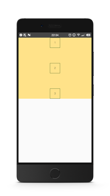
图8. justifyContent: 'space-between' 以及 alignItems: 'center'
然后,值得指出的是,flex这个属性,其实是flexGrow, flexShrink, flexBasis(对应的CSS属性flex-grow, flex-shrink和flex-basis)三个属性的结合。
我们通常在移动端看到的flex:1这个设置,其实是对flex-grow的设置。后者的默认值为0。使用把flex-grow设置为正整数的方法,可以让item按比例分布,或者在其他item为固定大小时撑满剩余的盒子空间,就仿佛具有弹性一样。
结构代码:
<View style={styles.container}> <View style={styles.flex1}></View> <View style={styles.flex2}></View> <View style={styles.flex3}></View> </View>
样式代码:
container: { flex: 1 }, flex1: { // height: 99, flexGrow: 1, backgroundColor: 'orange', }, flex2: { flexGrow: 2, backgroundColor: 'lightblue', }, flex3: { flexGrow: 3, backgroundColor: 'green', },
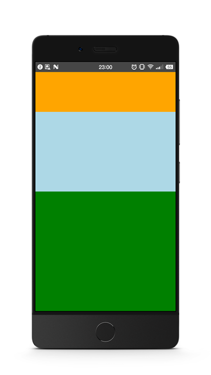
图9. 按比例分布
需要注意的是,如果父容器的尺寸为零(即没有设置宽高,或者没有设定flex),即使子组件如果使用了flex,也是无法显示的。
所以这里最外层的使用了flex布局的,flex:1,表示让它占据了垂直的整个空间。
三、小小实战演练
让我们来简单使用flex布局,对之前的例子稍加调整,实现一个头部,底部固定高度,中间内容占满剩下的屏幕的布局:
第一步,调整结构:
<View style={styles.container}> <View style={styles.header}></View> <View style={styles.body}></View> <View style={styles.footer}></View> </View>
调整样式:
container: { flex: 1 }, header: { height: 60, backgroundColor: 'orange', }, body: { flexGrow: 1, backgroundColor: 'lightblue', }, footer: { height: 60, backgroundColor: 'green', }
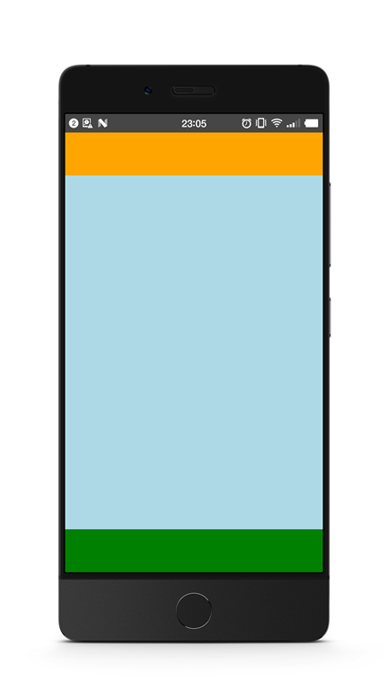
图10. 有头尾的布局
第二部,给header添加标题。
我们让头部的分成3部分,左边模拟一个返回按钮,中间显示标题文字,右边模拟一把小叉:
<View style={styles.header}> <Text style={styles.back}>返回</Text> <Text style={styles.title}>这是一个标题</Text> <Text style={styles.exit}>×</Text> </View>
需要把header的flexDirection设置为水平方向:
header: { height: 60, backgroundColor: 'orange', flexDirection: 'row', alignItems: 'center' }, back: { color: 'white', marginLeft: 15 }, title: { flexGrow: 1, fontSize: 20, color: 'white', textAlign: 'center' }, exit: { marginRight: 20, fontSize: 20, color: 'white' }
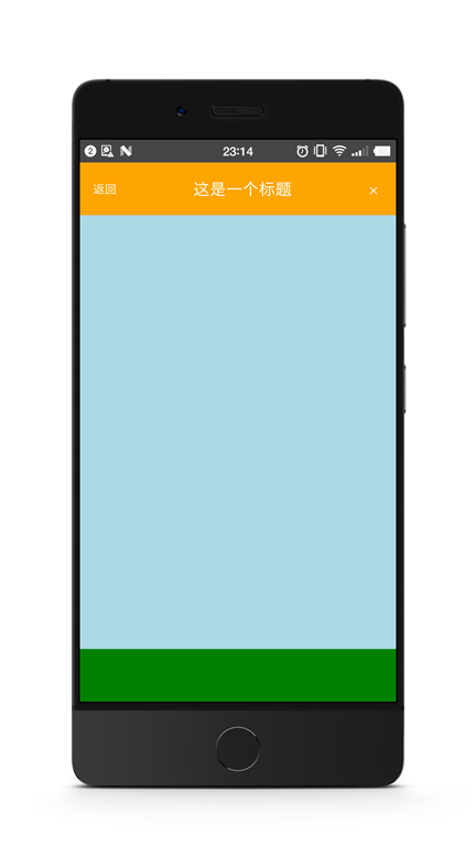
图11. header有了标题
第三步,我们可以把footer三等分,模拟成菜单的样子:
<View style={styles.footer}> <Text style={styles.firstMenu}>添加</Text> <Text style={styles.menu}>删除</Text> <Text style={styles.menu}>修改</Text> </View>
添加样式:
footer: { height: 60, backgroundColor: 'green', flexDirection: 'row', alignItems: 'center' }, menu: { flexGrow: 1, textAlign: 'center', borderColor: 'white', borderLeftWidth: 1, color: 'white' }, firstMenu: { flexGrow: 1, textAlign: 'center', color: 'white' },
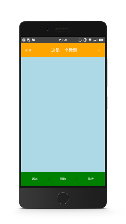
图12. footer三等分 模拟菜单
最后,让我们在body里也填入几个带按钮的输入框。
引入TextInput和Button组件,然后把它们分三组放入body中,
<View style={styles.body}> <View style={styles.inputRow}> <TextInput style={styles.textInput}></TextInput> <Button style={styles.btn} onPress={() => {}} title="确定"></Button> </View> <View style={styles.inputRow}> <TextInput style={styles.textInput}></TextInput> <Button style={styles.btn} onPress={() => {}} title="非常确定"></Button> </View> <View style={styles.inputRow}> <TextInput style={styles.textInput}></TextInput> <Button style={styles.btn} onPress={() => {}} title="确定一定以及肯定"></Button> </View> </View>
添加样式: