这是一个使用css3+jQuery实现的轮播图效果,以前还没接触css3时,觉得效果挺酷炫的,但是实现挺复杂的,今天研究了一下,发现特别简单,稍微动用一下空间想象力就好了,下面时效果图
1.这是html代码
<!DOCTYPE html> <html lang="en"> <head> <meta charset="UTF-8"> <title>3D切割轮播图</title> </head> <body> <div> <ul> //每个li由4个span组成,刚好组成正方体前、后、上、下 四个面, <li> <span></span> <span></span> <span></span> <span></span> </li> <li> <span></span> <span></span> <span></span> <span></span> </li> <li> <span></span> <span></span> <span></span> <span></span> </li> <li> <span></span> <span></span> <span></span> <span></span> </li> <li> <span></span> <span></span> <span></span> <span></span> </li> </ul> //左右切换按钮 <div> <a href="javascript:;"><</a> <a href="javascript:;">></a> </div> </div> <script src="https://www.jb51.net/js/jquery-1.12.4.js"></script> <script src="https://www.jb51.net/js/index.js"></script> </body> </html>
2.这是css代码
*{ padding:0; margin: 0; } .box{ width: 600px; height: 300px; border: 1px solid #ccc; margin: 150px auto; position: relative; } .box .left, .box .right{ position: absolute; top: 50%; width: 40px; height: 40px; line-height: 40px; margin-top: -20px; text-align: center; text-decoration:none; font-weight: bold; font-size: 40px; color: #ccc; background-color: rgba(255,255,255,.2); } .box .right{ right: 0; } .images-box{ width: 100%; height: 100%; list-style: none; } .images-box li { width: 120px; height: 100%; float: left; position: relative; /*使被转换的子元素保留其 3D 转换*/ transform-style: preserve-3d; transition:all 6s; /*控制旋转时间*/ } .images-box li span{ width: 100%; height: 100%; position: absolute; top: 0; left: 0; background: url("images/1.jpg")no-repeat ; } /*拼接立体容器,每个面使用不同的背景图*/ .box .images-box li span:nth-child(1){ background-image: url("images/1.jpg"); transform: translateZ(150px); } .box .images-box li span:nth-child(2){ background-image: url("images/2.jpg"); transform: rotateX(90deg) translateZ(150px); } .box .images-box li span:nth-child(3){ background-image: url("images/3.jpg"); transform: rotateX(180deg) translateZ(150px); } .box .images-box li span:nth-child(4){ background-image: url("images/4.jpg"); transform: rotateX(270deg) translateZ(150px); } /*拼接背景图*/ .images-box li:nth-child(1) span{ background-position: 0 0; } .images-box li:nth-child(2) span{ background-position: -120px 0; } .images-box li:nth-child(3) span{ background-position: -240px 0; } .images-box li:nth-child(4) span{ background-position: -360px 0; } .images-box li:nth-child(5) span{ background-position: -480px 0; }
3.这是js代码,这里用到jquery,需提前引入
$(function () { var index=0; //旋转角度记录 var flag=true; $('.left').on('click',function () { if(!flag) return false; flag=false; index--; var angle=-index*90; $('.images-box li').css('transform','rotateX('+angle+'deg)').each(function (i,item) { // 每个模块延时不同,即可看出切换3d效果 $(this).css('transition-delay',i*0.25+'s'); }); }); $('.right').on('click',function () { if(!flag) return false; flag=false; index++; var angle=-index*90; $('.images-box li').css('transform','rotateX('+angle+'deg)').each(function (i,item) { $(this).css('transition-delay',i*0.25+'s'); }); }); //节流阀,防止连续、快速、多次点击 $('li:last').on('transitionend',function () { flag=true; }); }) </script>
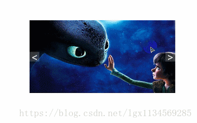
这是页面所用的图片
1.jpg

2.jpg

3.jpg

4.jpg
完整代码点击此处本站下载。
更多关于jQuery相关内容感兴趣的读者可查看本站专题:《jQuery图片操作技巧大全》、《jQuery表格(table)操作技巧汇总》、《jQuery切换特效与技巧总结》、《jQuery扩展技巧总结》、《jQuery常用插件及用法总结》、《jQuery常见经典特效汇总》及《jquery选择器用法总结》