要想移动端适配 并使用 rem 您需要先看这篇文章,配置好less ➡️ 在vue 中使用 less,就可以使用rem了
如果项目已经开发的差不多了,没有用到rem 又要使用rem,您用这招。
postcss-pxtorem:转换px为rem的插件
安装 postcss-pxtorem
npm install postcss-pxtorem --save
新建rem.js文件
const baseSize = 32 // 设置 rem 函数 function setRem () { // 当前页面宽度相对于 750 宽的缩放比例,可根据自己需要修改。 const scale = document.documentElement.clientWidth / 750 // 设置页面根节点字体大小 document.documentElement.style.fontSize = (baseSize * Math.min(scale, 2)) + 'px' } // 初始化 setRem() // 改变窗口大小时重新设置 rem window.onresize = function () { setRem() }
并引用进main.js文件内
import './rem'
修改.postcssrc.js 文件
在.postcssrc.js文件内的 plugins 添加以下配置,配后就可以在开发中直接使用 px 单位开发了
"postcss-pxtorem": { "rootValue": 32, "propList": ["*"] }
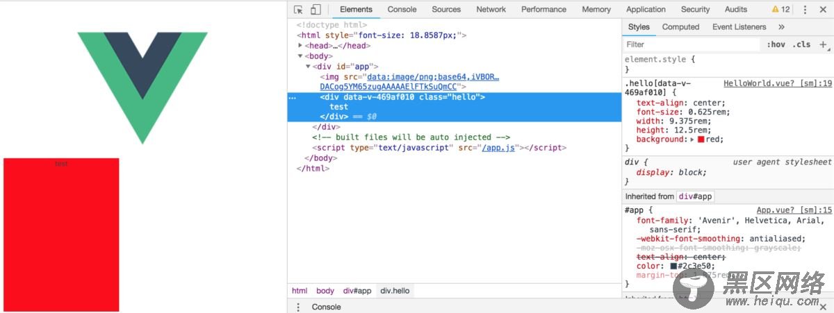
helloworld.vue
<template> <div> test </div> </template> <script> export default { name: 'HelloWorld', data() { return { msg: 'Welcome to Your Vue.js App' } } } </script> <style scoped> .hello { text-align: center; font-size: 20px; width: 300px; height: 400px; background:red; } </style>
效果
补充:下面看下Vue用rem布局
使用vue.js搭建一个移动端项目,怎样做到自适应呢?当然选择rem布局是比较方便快捷的。
在使用vue-cli搭建好项目框架后,在目录结构的index.html文件中添加一段代码:
<script> fnResize() window.onresize = function () { fnResize() } function fnResize() { var deviceWidth = document.documentElement.clientWidth || window.innerWidth if (deviceWidth >= 750) { deviceWidth = 750 } if (deviceWidth <= 320) { deviceWidth = 320 } document.documentElement.style.fontSize = (deviceWidth / 7.5) + 'px' } </script>
之后,在写css时,只要将px单位替换成rem,这里设置的比例是100px=1rem,例如,宽度为100px时,可以直接写成1rem。
总结
以上所述是小编给大家介绍的vue使用rem实现 移动端屏幕适配 ,希望对大家有所帮助,如果大家有任何疑问请给我留言,小编会及时回复大家的。在此也非常感谢大家对脚本之家网站的支持!
您可能感兴趣的文章: