这里将通过四个实践小案例来体验和学习css过渡,css动画,javascript钩子,列表过渡的应用。至于案例用到的知识点就请自行学习官网文档。
1.css过渡–实践
先来看看demo效果:
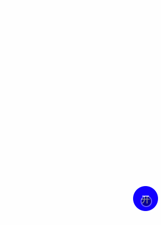
这个案例其实很简单,通过一个transition来触发多个子元素的过渡效果,我们只需要定义元素对应的过渡效果就可以,其他事情vue会帮我们搞定,由此可以扩展出其他酷炫的过渡场景效果。先来看看这个简单案例的代码实现:
<template> <div> <button @click="showMenu">{{text}}</button> <transition> <div v-show="show"> <div>1</div> <div>2</div> <div>3</div> </div> </transition> </div> </template> <script type="text/ecmascript-6"> export default { data () { return { show: false }; }, methods: { showMenu () { this.show = !this.show; } }, computed: { text () { return this.show ? '收' : '开'; } } }; </script> <style lang="stylus"> .app .btn position: fixed bottom: 50px right: 10px z-index: 10 width: 50px height: 50px line-height: 50px border-radius: 50% border: none outline: none color: #fff font-size: 18px background: blue .menu position: fixed bottom: 50px right: 10px width: 50px height: 50px border-radius: 50% transition: all .7s ease-in &.move-enter-active .inner transform: translate3d(0, 0, 0) transition-timing-function: cubic-bezier(0, .57, .44, 1.97) .inner-1 transition-delay: .1s .inner-2 transition-delay: .2s .inner-3 transition-delay: .3s &.move-enter, &.move-leave-active .inner transition-timing-function: ease-in-out .inner-1 transform: translate3d(0, 60px, 0) transition-delay: .3s .inner-2 transform: translate3d(40px, 40px, 0) transition-delay: .2s .inner-3 transform: translate3d(60px, 0, 0) transition-delay: .1s .inner display: inline-block position: absolute width: 30px height: 30px line-height: 30px border-radius: 50% background: red text-align: center color: #fff transition: all .4s .inner-1 top: -50px left: 10px .inner-2 left: -30px top: -30px .inner-3 left: -50px top: 10px </style>
可以看到我们的代码基本主要是完成css过渡效果的样式,而触发过渡效果只是简单地通过一个click事件就搞定了,vue会自动嗅探目标元素是否有 CSS 过渡或动画,并在合适时添加/删除 CSS 类名。那下一个demo就来简单实现一下使用css animation 做过渡的效果。
2.css 动画–实践
先来看看demo效果:
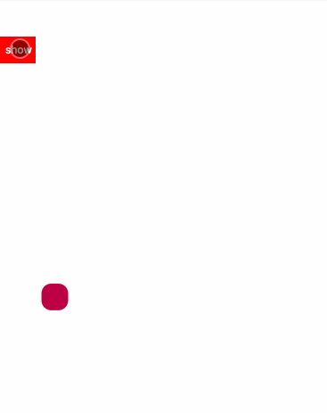
这个案例其实跟上面的demo差不多,不同之处在于过渡效果是使用css动画来实现,看下实现的代码:
<template> <div> <button @click="showball">show</button> <transition type="animation"> <div v-show="show"> <div></div> </div> </transition> </div> </template> <script type="text/ecmascript-6"> export default { data () { return { show: false }; }, methods: { showball () { this.show = !this.show; } } }; </script> <style lang="stylus"> @keyframes shape-change { 0%, 100% { border-radius: 50% background: red } 50% { border-radius: 0 background: blue } } @keyframes moveball-in { 0% { transform: translate3d(300px,-200px,0) } 50% { transform: translate3d(100px,-400px,0) } 100% { transform: translate3d(0,0,0) } } @keyframes moveball-out { 0% { transform: translate3d(0,0,0) } 50% { transform: translate3d(100px,-400px,0) } 100% { transform: translate3d(300px,-200px,0) } } .app .btn width: 40px height: 30px margin-top: 40px border: none outline: none background: red color: #fff .ball position: absolute bottom: 20px left: 20px width: 50px height: 50px transition: all 1s cubic-bezier(.22,-0.86,.97,.58) &.move-enter-active opacity: 1 animation: moveball-in 1s .inner animation: shape-change 1s &.move-leave-active opacity: 0.8 animation: moveball-out 1s .inner animation: shape-change 1s .inner display: inline-block width: 30px height: 30px border-radius: 50% background: red transition: all 1s linear </style>
从css代码可以看出,我们只是在vue过渡类名下加了不同的animation而已。官网文档明确说明当只使用transition或animation其中一种时,vue是能自动监听对应的类型的,但是如果同一个元素同时使用两种效果,就需要明确指定监听哪一种类型,不过官网并没有给出具体的栗子。那其实这个demo已经简单地实现同时使用两种类型的情况,可以看到有一个透明度的变化。但是假如animation里使用了transform,并且外面也使用了transform的话,那么元素在过渡的时候动画效果就会有冲突,效果就有点出入了。
3.JavaScript钩子 – 实践