项目书写步骤
github地址:https://github.com/xuhuihui/dataCom
参考文章:https://www.jb51.net/article/156259.htm
前言:我先git clone官方github,运行查看完整效果。 再根据官网介绍和参考文章,结合完整的代码,自己一步步配置内容。最后,参考element的设计样式,修改并增加代码,形成一个平台组件库的网站。
(1)在已有项目中安装
# 安装为本地依赖项 npm install -D vuepress # 创建一个 docs 目录 mkdir docs # 创建一个 markdown 文件 echo '# Hello VuePress' > docs/README.md # 给package.json 添加一些 scripts 脚本:{ "scripts": { "docs:dev": "vuepress dev docs", "docs:build": "vuepress build docs" } }# 运行项目 yarn run docs:dev
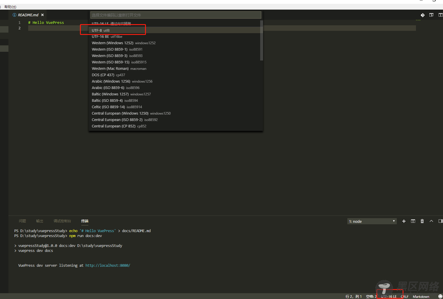
出现显示文档乱码问题,如图所示:
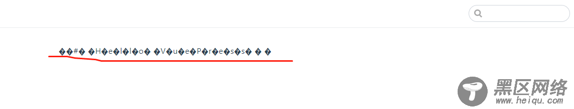
解决方式:修改md文件编码为UTF-8
改变md文件的内容如下:
--- home: true actionText: 前往 → actionLink: /baseComponents/ features: - title: 布局类组件 details: 基本组件,为常用组件提供快速,可用的组件 - title: 可视化组件 details: 积累将数据可视化的业务组件 - title: 知识库 details: 积累前端相关的知识,涵盖 vue、react、koa2、nodejs 相关的知识点 ---
(2)配置文件
配置(参考链接:) VuePress 站点的基本文件是 .vuepress/config.js,其中导出一个 JavaScript 对象:
module.exports = { title: 'data Com', // 设置网站标题 description: 'Just for fun', //描述 dest: './dist', // 设置输出目录 port: 2233, //端口 themeConfig: { //主题配置 // 添加导航栏 nav: [ { text: '主页', link: 'https://www.jb51.net/' }, // 导航条 { text: '组件文档', link: '/baseComponents/' }, { text: '知识库', link: '/knowledge/' }, { text: 'github', // 这里是下拉列表展现形式。 items: [ { text: 'focus-outside', link: 'https://github.com/TaoXuSheng/focus-outside' }, { text: 'stylus-converter', link: 'https://github.com/TaoXuSheng/stylus-converter' }, ] } ], // 为以下路由添加侧边栏 sidebar:{ '/baseComponents/': [ { title: '布局类组件', collapsable: true, children: [ 'base/test1', 'base/test2', 'base/test3', 'base/test4', ] }, { title: '可视化组件', collapsable: true, children: [ ] }, { title: '工具类组件', collapsable: true, children: [ ] }, { title: '方法类函数', collapsable: true, children: [ ] } ], '/knowledge/': [ { title: 'CSS知识库', collapsable: false, children: [ ] }, { title: 'JS知识库', collapsable: false, children: [ ] }, { title: 'node知识库', collapsable: false, children: [ ] }, { title: 'vue知识库', collapsable: false, children: [ ] } ] } } }
主题配置部分:在.vuepress/override.styl修改样式:
$accentColor = #3EB9C8 // 主题色 $textColor = #2c3e50 // 文字颜色 $borderColor = #eaecef // 边框颜色 $codeBgColor = #282c34 // 代码背景颜色 // 代码库重置 .content pre{ margin: 0!important;}
(3)增加其它扩展插件
插件npm安装:element-ui,vue-echarts,vue-highlight。。
在.vuepress/enhanceApp.js引入:
/** * 扩展 VuePress 应用 */ import VueHighlightJS from 'vue-highlight.js'; import 'highlight.js/styles/atom-one-dark.css'; import Element from 'element-ui' import 'element-ui/lib/theme-chalk/index.css' import VueECharts from 'vue-echarts' //注册图表 import './public/css/index.css' //组件css文件 export default ({ Vue, // VuePress 正在使用的 Vue 构造函数 options, // 附加到根实例的一些选项 router, // 当前应用的路由实例 siteData // 站点元数据 }) => { // ...做一些其他的应用级别的优化 Vue.use(VueHighlightJS) Vue.use(Element) Vue.component('chart', VueECharts) }
(4)Markdown 拓展
调用别人写好的轮子:https://www.npmjs.com/package/vue-highlight.js
<highlight-code slot="codeText" lang="vue"> <template> <div> <div> <dt-button>默认按钮</dt-button> <dt-button type="primary">主要按钮</dt-button> <dt-button type="success">成功按钮</dt-button> <dt-button type="info">信息按钮</dt-button> <dt-button type="warning">警告按钮</dt-button> <dt-button type="danger">危险按钮</dt-button> </div> </template> </highlight-code>
(5)在Markdown 使用Vue-----插入按钮样式
#先写一个按钮组件.\vuepress\docs\.vuepress\components\src\button.vue