Bootstrap 提供了下列类型的表单布局:
•垂直表单(默认) -> 这个不好看,都是手机版了,PC版占一排不好看;
•内联表单 -> 我相信这个才是你想要的,PC版响应横排,手机版响应竖排。
•水平表单 -> 用栅格系统控制显示
一、垂直表单
垂直表单使用的标准步骤
1.<form> 元素添加 role="form"。
2.把标签和控件放在一个带有"form-group"的<div> 中,获取最佳间距。
3.向所有的文本元素 <input>、<textarea> 和 <select> 添加"form-control"样式。
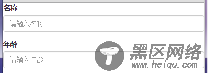
<form role="form"> <div> <label for="name">名称</label> <input type="text" placeholder="请输入名称"> </div> <div> <label for="name">年龄</label> <input type="text" placeholder="请输入年龄"> </div> </form>
二、内联布局
内联布局与垂直布局其他完全一样,只是需要给<form role="form">加个class=form-inline。
<form role="form">
使用这样的内联布局之后,就是大屏幕横排显示,小屏幕垂直显示。
小屏幕:
大屏幕:

三、水平表单
水平表单指的是Label标签与控件(input、button)之间的水平。
其使用步骤如下:
•向父 <form> 元素添加 class .form-horizontal。
•把标签和控件放在一个带有 class .form-group 的 <div> 中。
•向标签添加 class .control-label。
<form role="form"> <div> <label for="name">名称</label> <div> <input type="text" placeholder="请输入名称"> </div> </div> <div> <label for="name">年龄</label> <div> <input type="text" placeholder="请输入年龄"> </div> </form>
使用了form-horizontal之后,才能给input控件套div,并且div也能够使用网格系统了。form-horizontal样式改变了.form-group的行为,将其表现得像栅格中的行(row)一样。
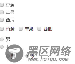
四、复选框Checkbox和单选框Radio
这两个控件在Bootstrap里面比较特殊,有时候需要横排,有时候需要竖排。
它也跟form一样,也是有内联的。
•如果需要内联显示,则设置其外层包围的label的class为checkbox-inline。
•如果需要默认的竖排显示,则设置外层包围的label的class为heckbox。
<form role="form"> <!-- 复选 --> <div> <label><input type="checkbox" value="">香蕉</label> </div> <div> <label><input type="checkbox" value="">苹果</label> </div> <div> <label><input type="checkbox" value="">西瓜</label> </div> <div> <label><input type="checkbox" value="">香蕉</label> </div> <div> <label><input type="checkbox" value="">苹果</label> </div> <div> <label><input type="checkbox" value="">西瓜</label> </div> <!-- 单选 --> <div> <label> <input type="radio" value="option1" checked> 男 </label> </div> <div> <label> <input type="radio" value="option2" checked> 女 </label> </div> <div> <label> <input type="radio" value="option1" checked> 男 </label> </div> <div> <label> <input type="radio" value="option2" checked> 女 </label> </div> </form>
其显示效果如下:
五、静态控件
静态控件指的是那些不能够改变值的控件,在bootstrap中,当您需要在一个水平表单内的表单标签后放置纯文本时,请在 <p> 上使用class="form-control-static"。
<form role="form"> <div> <label>名称</label> <div> <p>刘玄德</p> </div> </div> </form>
显示效果如下:
六、表单帮助文本
Bootstrap表单帮助文本一般指的是输入录入的提示,通常在input后面跟个.help-block的HTML元素就可以了。
<form role="form"> <div> <input type="text" > <span> 特别提醒,如果你没有什么,就不要输入了。 </span> </div> </form>
显示效果如下: