<div> <div> <em></em> <span></span> </div> 我是龙恩 我在气泡框内</div>.longen {width:300px; height:100px;position:relative; background-color:red;margin:50px auto 0;}.arrow{ position:absolute; width:70px; height:60px; left:-70px; bottom:10px;}.arrow *{position:absolute; border-style:dashed solid solid dashed; font-size:0; line-height:0; }.arrow em{border-color:transparent #09F #09F transparent; border-width:30px 35px;} .arrow span{ border-width:20px 35px;border-color:transparent #FFF #FFF transparent; bottom:0;}
二: 除了通过设置元素的border来模拟小三角之外,还可以用特殊字符来模拟,用特殊字符模拟小三角同样需要用到定位和重叠覆盖,只不过不需要调整border属性了。
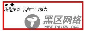
先来看一个菱形“◆” ,它在页面中的代码是“◆”,需要注意的是页面编码需要设置为utf-8,在网页中可以把◆当作文字处理,可以通过调整font-size来它的大小、通过color来设置它的颜色。
hTML代码如下:
<div> <div> <em>◆</em> <span>◆</span> </div> 我是龙恩 我在气泡框内</div>
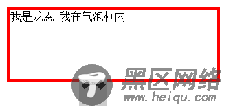
先来设置最外层div的样式,得到一个矩形框:
代码如下:
.longen{ width:300px; height:100px;position:relative; border:5px solid red; margin:50px auto 0;}
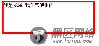
接着定位箭头最外层容器div,便于观察可以先设置一个背景色 :
.arrow{ position:absolute; width:40px; height:40px; left:100px; bottom:-40px; background:#ccc;overflow:hidden;}
再对◆设置样式:
.arrow *{position:absolute; font-size:40px; line-height:40px; width:40px; font-family:SimSun; font-style:normal; font-weight:normal; text-align:center; vertical-align:middle;}
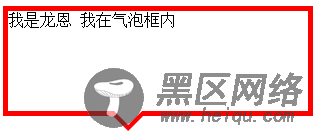
图如下:
注意:为了◆主流浏览器中显示一致,需要清除浏览器的默认字体样式,特别注意这里字体的设置再分别修改em、span标签的字体颜色,并对这两个标签定位:代码如下:
.arrow em{ color:red; top:-15px;}.arrow span{ color:#fff; top:-21px;}
最终效果图还是和上面一样 如下:
完整代码如下:
<div> <div> <em>◆</em> <span>◆</span> </div> 我是龙恩 我在气泡框内</div> .longen{ width:300px; height:100px;position:relative; border:5px solid red; margin:50px auto 0;}.arrow{ position:absolute; width:40px; height:40px; left:100px; bottom:-40px;overflow:hidden;}.arrow *{position:absolute; font-size:40px; line-height:40px; width:40px; font-family:SimSun; font-style:normal; font-weight:normal; text-align:center; vertical-align:middle;}.arrow em{ color:red; top:-15px;}.arrow span{ color:#fff; top:-21px;}
补充:以上方式实现小三角的过程中不可避免的增加了多余的标签,如果不要求所有浏览器中显示一致的话, 我们可以利用css3来实现这个小三角.<div> css3气泡框</div>.longen{ width:300px; height:100px; border:5px solid #09F; position:relative; background-color:#FFF; } .longen:before,.longen:after{ content:"";display:block; border-width:20px; position:absolute; bottom:-40px; left:100px; border-style:solid dashed dashed; border-color:#09F transparent transparent; font-size:0; line-height:0; } .longen:after{ bottom:-33px; border-color:#FFF transparent transparent; }
效果和上面一样。本人也是通过google的 自己研究下 做的demo 确实还不错 所以就分享出来了 如果分析的不清晰 请各位大牛多多指教!本人能力暂时有限!!
您可能感兴趣的文章: