
Hello!小伙伴!
非常感谢您阅读海轰的文章,倘若文中有错误的地方,欢迎您指出~
自我介绍 ଘ(੭ˊᵕˋ)੭
昵称:海轰
标签:程序猿|C++选手|学生
简介:因C语言结识编程,随后转入计算机专业,有幸拿过国奖、省奖等,已保研。目前正在学习C++/Linux(真的真的太难了~)
学习经验:扎实基础 + 多做笔记 + 多敲代码 + 多思考 + 学好英语!
【动画消消乐】 平时学习生活比较枯燥,无意之间对一些网页、应用程序的过渡/加载动画产生了浓厚的兴趣,想知道具体是如何实现的? 便在空闲的时候学习下如何使用css实现一些简单的动画效果,文章仅供作为自己的学习笔记,记录学习生活,争取理解动画的原理,多多“消灭”动画!

HTML
<!DOCTYPE html> <html lang="en"> <head> <meta charset="UTF-8"> <meta http-equiv="X-UA-Compatible" content="IE=edge"> <meta content="width=device-width, initial-scale=1.0"> <link href="http://www.likecs.com/style.css"> <title>Document</title> </head> <body> <section> <div> <div></div> <div></div> <div></div> <div></div> </div> </section> </body> </html>CSS
html, body { margin: 0; height: 100%; } body { display: flex; justify-content: center; align-items: center; background-color: #5e825a; animation: backColor 4s infinite; } section { width: 650px; height: 300px; padding: 10px; position: relative; display: flex; align-items: center; justify-content: center; border: 2px solid white; } .box { width: 100px; height: 100px; display: flex; flex-wrap: wrap; } .box>div:nth-child(1) { width: 50px; height: 50px; background-color: #c0f0b9; animation: load1 4s infinite; } .box>div:nth-child(2) { width: 50px; height: 50px; background-color: #f0d8ad; animation: load2 4s infinite; } .box>div:nth-child(3) { width: 50px; height: 50px; background-color: #f0addb; animation: load3 4s infinite; } .box>div:nth-child(4) { width: 50px; height: 50px; background-color: #c4d8f0; animation: load4 4s infinite; } @keyframes load1 { from { transform: translate(0); } 25% { transform: translate(100%); } 50% { transform: translate(100%, 100%); } 75% { transform: translate(0, 100%); } } @keyframes load2 { from { transform: translate(0); } 25% { transform: translate(0, 100%); } 50% { transform: translate(-100%, 100%); } 75% { transform: translate(-100%, 0); } } @keyframes load3 { from { transform: translate(0); } 25% { transform: translate(0, -100%); } 50% { transform: translate(100%, -100%); } 75% { transform: translate(100%); } } @keyframes load4 { from { transform: translate(0); } 25% { transform: translate(-100%, 0); } 50% { transform: translate(-100%, -100%); } 75% { transform: translate(0, -100%); } } @keyframes backColor { from { background-color: #5e825a; } 25% { background-color: #82466e; } 50% { background-color: #425e82; } 75% { background-color: #423827; } } 原理详解 步骤1使用一个div作为包含四个小方块的大容器
其中每个小方块也是用一个div表示
<div> <div></div> <div></div> <div></div> <div></div> </div>设置为
宽度、高度均为100px
flex布局
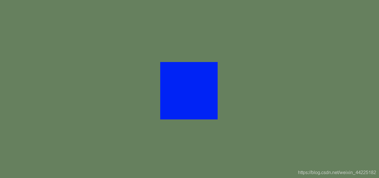
背景色:蓝色
.box { width: 100px; height: 100px; display: flex; flex-wrap: wrap;// 换行 background-color: blue; }效果图如下
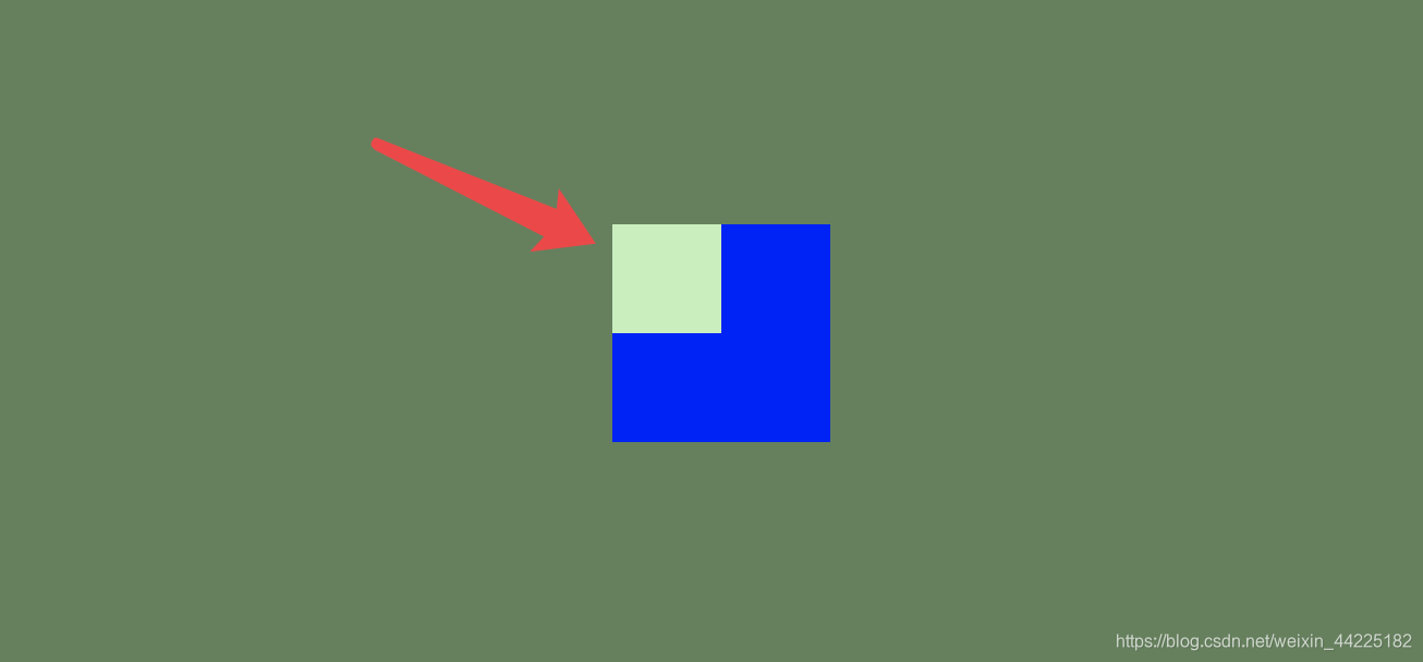
分别设置四个小方块 均匀分布
宽度、高度均为50px
颜色为四种(自定义)
.box>div:nth-child(1) { width: 50px; height: 50px; background-color: #c0f0b9; } .box>div:nth-child(2) { width: 50px; height: 50px; background-color: #f0d8ad; } .box>div:nth-child(3) { width: 50px; height: 50px; background-color: #f0addb; } .box>div:nth-child(4) { width: 50px; height: 50px; background-color: #c4d8f0; }效果图如下

为每个小方块添加动画
这里以一个方块为例
动画简化为关键四个步骤
右移
再下移
再左移
最后上移