
哈喽哈喽!CSS真的好好玩啊,哈哈,反正我是爱了,空闲写着玩。画画不好的我乐了,下面就是一个用CSS3动画完成的模仿水珠的动效,其中主要就是会使用CSS设置阴影效果以及@keyframes关键帧和一些选择器的技术,快来学习吧!!!🐬
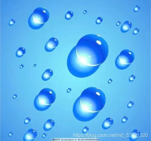
实现效果:就很nice
你也通过一下网址进行访问水滴点击进入

灵感:看到了这张图阴影高亮,这属于美术吧,哈哈,我是小菜鸡
这里强烈安利GitHub上一个大牛的开源:利用这个可以使这个效果实现的事半功倍,好开始coding
1.html很简单,只需要一个盒子就OK了
<!DOCTYPE html> <html lang="en"> <head> <meta charset="UTF-8"> <meta http-equiv="X-UA-Compatible" content="IE=edge"> <meta content="width=device-width, initial-scale=1.0"> <title>水滴</title> </head> <body> <div></div> </body> </html>
2.CSS注释已经写在代码中,这里主要学习一下伪元素选择器的使用,box-shadow这个设置阴影的属性,关键帧 @keyframes以及关键帧的使用 animation,和 border-radius: 30% 70% 70% 30% / 30% 35% 65% 70%;这个属性的使用
/*清除body的影响*/ *{ margin: 0; padding: 0; } /*设置背景颜色*/ body{ background-color: rgba(40, 134, 241, 0.925); } /* 初始一下水,大小,弯曲,阴影*/ .shui{ width: 400px; height: 400px; position: absolute; top: 50%; left: 50%; transform: translate(-50%,-50%); /* 测试用的边框 */ /* border: 1px solid; */ box-sizing: border-box; /* 设置弯曲 */ border-radius: 30% 70% 70% 30% / 30% 35% 65% 70%; /* 设置box-shadow :水平方向阴影 垂直方向阴影 模糊距离 阴影尺寸 阴影颜色 内/外阴影(inset/outset(默认)) 盒子阴影可以有多组值,之间用逗号隔开 水平阴影和垂直阴影必须写,其余4个是可选的*/ box-shadow: inset 10px 20px 30px rgba(0, 0, 0, 0.5), 10px 10px 20px rgba(0, 0, 0, 0.3), 15px 15px 30px rgba(0, 0, 0, 0.05), inset -10px -10px 15px rgba(255, 255, 254, 0.83); /*使用关键帧 watermove 9s播放 匀速 无限循环*/ animation: watermove 9s linear infinite; } /* 伪元素选择器:在^之后插入 */ .shui::after{ content: ""; position: absolute; width: 35px; height: 35px; background: rgba(255, 255, 255, 0.82); border-radius: 50%; left: 60px; top: 80px; /*使用关键帧 watermove 4s播放 匀速 无限循环*/ animation: watermove 4s linear infinite; } /* 伪元素选择器:在当前盒子最前插入一个东西 */ .shui::before{ content: ""; position: absolute; width: 20px; height: 20px; background: rgba(255, 255, 255, 0.82); border-radius: 50%; left: 120px; top: 55px; /*使用关键帧 watermove 4s播放 匀速 无限循环*/ animation: watermove 4s linear infinite; } /* 关键帧 */ @keyframes watermove{ 20%{ border-radius: 30% 70% 53% 47% / 28% 44% 56% 72%; } 40%{ border-radius: 30% 70% 39% 61% / 34% 39% 61% 66%; } 60%{ border-radius: 25% 75% 45% 55% / 40% 55% 45% 60%; } 80%{ border-radius: 28% 72% 31% 69% / 32% 39% 61% 68%; } }
3.完整代码<!DOCTYPE html> <html lang="en"> <head> <meta charset="UTF-8"> <meta http-equiv="X-UA-Compatible" content="IE=edge"> <meta content="width=device-width, initial-scale=1.0"> <title>水滴</title> <style> /*清除body的影响*/ *{ margin: 0; padding: 0; } /*设置背景颜色*/ body{ background-color: rgba(40, 134, 241, 0.925); } /* 初始一下水,大小,弯曲,阴影*/ .shui{ width: 400px; height: 400px; position: absolute; top: 50%; left: 50%; transform: translate(-50%,-50%); /* 测试用的边框 */ /* border: 1px solid; */ box-sizing: border-box; /* 设置弯曲 */ border-radius: 30% 70% 70% 30% / 30% 35% 65% 70%; /* 设置box-shadow :水平方向阴影 垂直方向阴影 模糊距离 阴影尺寸 阴影颜色 内/外阴影(inset/outset(默认)) 盒子阴影可以有多组值,之间用逗号隔开 水平阴影和垂直阴影必须写,其余4个是可选的*/ box-shadow: inset 10px 20px 30px rgba(0, 0, 0, 0.5), 10px 10px 20px rgba(0, 0, 0, 0.3), 15px 15px 30px rgba(0, 0, 0, 0.05), inset -10px -10px 15px rgba(255, 255, 254, 0.83); /*使用关键帧 watermove 9s播放 匀速 无限循环*/ animation: watermove 9s linear infinite; } /* 伪元素选择器:在^之后插入 */ .shui::after{ content: ""; position: absolute; width: 35px; height: 35px; background: rgba(255, 255, 255, 0.82); border-radius: 50%; left: 60px; top: 80px; /*使用关键帧 watermove 4s播放 匀速 无限循环*/ animation: watermove 4s linear infinite; } /* 伪元素选择器:在当前盒子最前插入一个东西 */ .shui::before{ content: ""; position: absolute; width: 20px; height: 20px; background: rgba(255, 255, 255, 0.82); border-radius: 50%; left: 120px; top: 55px; /*使用关键帧 watermove 4s播放 匀速 无限循环*/ animation: watermove 4s linear infinite; } /* 关键帧 */ @keyframes watermove{ 20%{ border-radius: 30% 70% 53% 47% / 28% 44% 56% 72%; } 40%{ border-radius: 30% 70% 39% 61% / 34% 39% 61% 66%; } 60%{ border-radius: 25% 75% 45% 55% / 40% 55% 45% 60%; } 80%{ border-radius: 28% 72% 31% 69% / 32% 39% 61% 68%; } } </style> </head> <body> <div></div> </body> </html>
OK,简简单单,快快乐乐,欢迎交流探讨,白白了你