
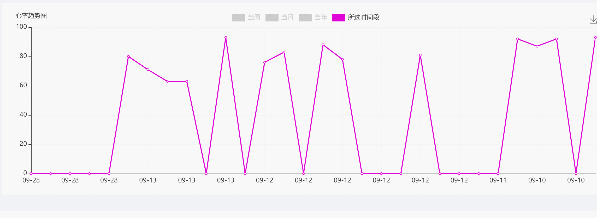
如果大家想实现如下图的效果那么久继续往下看吧,直接上动图!
因为项目需要展示的数据图表比较多我选择的是把每一张图表封装成一个vue组件来引用。
先上一个完整的代码,引用时注意在从数据库获取数据是要换成自己的数据库以及要自己定义好你需要的对象加到你设定好的数组中:
<template> <div> <div></div> </div> </template> <script> import echarts from 'echarts' export default { data() { return { ans:[], // dayX: [], // 当天的 X轴 weekX: [], // 当周的 X轴 monthX: [], // 当月的 X轴 yearX: [], // 当年的 X轴 timeX:[],//任意时间段的X轴 dataY: [] // Y 轴 } }, created() { this.fetchData() }, methods: { //获取数据库中的数据 fetchData() { this.axios({ method: 'GET', url: 'http://localhost:8080/xxxx/xxxx' }).then(function(resp) { console.log("oxygen ===>",resp.data) let num = resp.data.length //获取数组的长度 for (let i = 0; i <num; i++) { //创建一个对象 let arr = {} arr.timeX = resp.data[i].chkDate.slice(5, 10) arr.timeY = resp.data[i].oxgnSaturation vm.ans.push(arr) } }) }, init(dataX, dataY) { this.myChart = echarts.init(document.getElementById('main')) let option = { legend: { icon: 'stack', // data: ['当天', '当月', '当年'], data: ['当周', '当月','当年','所选时间段'], selectedMode: 'single', // 单选 selected: { 当周: true, 当月: false, 当年: false, 所选时间段: false } }, tooltip: { trigger: 'axis', axisPointer: { type: 'cross' }, //自定义显示标签 formatter:function(params) { return params[0].name + '<br>血氧 : '+params[0].data+' %' } }, // 工具栏 toolbox: { feature: { saveAsImage: {} //可对折线图进行截图保存 } }, grid: { left: 10, //组件距离容器左边的距离 right: 10, top: 30, bottom: 20, containLabel: true }, dataZoom: [ //通过鼠标控制折线图的放大缩小 { show: true, type: 'inside', filterMode: 'none', xAxisIndex: [0] }, { show: true, type: 'inside', filterMode: 'none', yAxisIndex: [0] } ], xAxis: { type: 'category', miniInterval: 3, boundaryGap: false, axisTick: { show: false }, splitLine: { // X 轴分隔线样式 show: true, lineStyle: { color: ['#f3f0f0'], width: 1, type: 'solid' } }, data: dataX }, yAxis: [ { name: "血氧趋势图", type: 'value', splitLine: { // Y 轴分隔线样式 show: true, lineStyle: { color: ['#f3f0f0'], width: 1, type: 'solid' } } } ], series: dataY } this.myChart.on('legendselectchanged', obj => { var options = this.myChart.getOption() //这里是选择切换什么样的x轴,那么他会进行对Y值的切换 if (obj.name == '当周'){ options.xAxis[0].data = this.weekX }else if (obj.name == '当月'){ options.xAxis[0].data = this.monthX }else if (obj.name == '当年'){ options.xAxis[0].data = this.yearX }else if (obj.name == '所选时间段'){ options.xAxis[0].data = this.timeX } this.myChart.setOption(options, true) }) // 使用刚指定的配置项和数据显示图表。 this.myChart.setOption(option) }, mounted() { setTimeout(() => { this.$nextTick(() => { this.monthX = (this.res.map(item => item.monthX)).filter(Boolean) //过滤掉undefined、NaN、null、空串 this.weekX = (this.res.map(item => item.weekX)).filter(Boolean) //过滤掉undefined、NaN、null、空串 this.yearX = (this.res.map(item => item.yearX)).filter(Boolean) //过滤掉undefined、NaN、null、空串 this.timeX = (this.ans.map(item => item.timeX)).filter(Boolean) //过滤掉undefined、NaN、null、空串 //对dataY进行赋值,如果这里想一个X轴对应多个Y值那么可以在加一个{} this.dataY.push({ name: '当月', type: 'line', // 直线ss itemStyle: { normal: { color: '#2E2E2E', lineStyle: { color: '#2E2E2E', width: 2 } } }, data: this.res.map(item => item.monthY) }) this.dataY.push({ //这边就可以自定义一个折线显示的方式和颜色 name: '当周', type: 'line', itemStyle: { normal: { color: '#FF0000', lineStyle: { color: '#FF0000', width: 2 } } }, data: this.res.map(item => item.weekY) }) this.dataY.push({ //这边就可以自定义一个折线显示的方式和颜色 name: '当年', //这个必须和lengen 那边的保持一致才行 type: 'line', itemStyle: { normal: { color: '#0404B4', lineStyle: { color: '#0404B4', width: 2 } } }, data: this.res.map(item => item.yearY) }) this.dataY.push({ //这边就可以自定义一个折线显示的方式和颜色 name: '所选时间段', type: 'line', itemStyle: { normal: { color: '#DF01D7', lineStyle: { color: '#DF01D7', width: 2 } } }, data: this.ans.map(item => item.timeY) }) this.init(this.weekX, this.dataY) //初始化的数据显示 window.onresize = this.myChart.resize //窗口大小图标自适应 }) }, 1000) } } </script>
结束,完工