在bootstrap中使用input时也必须添加type类型,如果没有指定type类型,将无法得到正确的样式,因为bootstrap框架都是通过input[type=”?”]的形式来定义样式的,如:text类型,对应得是input[type=”text”]
为了让控件在各种表单风格中样式不错,需要添加类名.form-control
<form role="form"> <div> <input type="email" placeholder="enter email" > </div> </form>
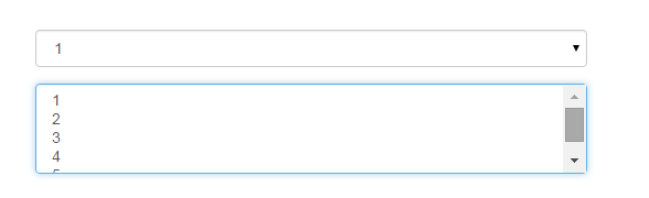
下拉选择框select
多行选择设置multiple属性的值为multiple
<form role="form"> <div> <select> <option>1</option> <option>2</option> <option>3</option> <option>4</option> <option>5</option> </select> </div> <div> <select multiple> <option>1</option> <option>2</option> <option>3</option> <option>4</option> <option>5</option> </select> </div> </form>
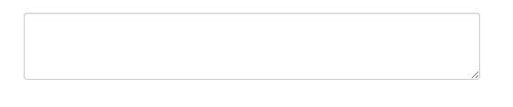
文本域textarea
文本域和原始使用方法一样,设置rows可定义其高度,设置cols可以定义其宽度,如果textarea元素中添加了类名.form-control,则无需设置cols属性,因为bootstrap框架中.form-control样式的标的空间宽度为100%或auto
<form role="form"> <div> <textarea rows="3"></textarea> </div> </form>
复选框checkbox和单选框radio
checkbox和radio与label标签配合使用会出现一些小问题(如对齐问题)
<form> <div> <label> <input type="checkbox"> 记住密码 </label> </div> <div> <label> <input type="radio" checked> 喜欢 </label> </div> <div> <label> <input type="radio">不喜欢 </label> </div> </form>
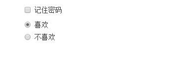
1、不管是checkbox还是radio都使用label包起来了
2、checkbox连同label标签放在一个名为.checkbox的容器内
3、radio连同label标签放在一个名为.radio的容器内,bootstrap主要借助.checkbox和.radio样式来处理复选框、单选按钮与标签的对齐方式
.radio, .checkbox { display: block; min-height: 20px; padding-left: 20px; margin-top: 10px; margin-bottom: 10px; } .radio label, .checkbox label { display: inline; font-weight: normal; cursor: pointer; } .radio input[type="radio"], .radio-inline input[type="radio"], .checkbox input[type="checkbox"], .checkbox-inline input[type="checkbox"] { float: left; margin-left: -20px; } .radio + .radio, .checkbox + .checkbox { margin-top: -5px; }
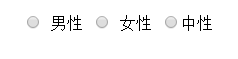
复选框和单选按钮水平排列
1、如果checkbox需要水平排列,只需要在label标签上添加类名.checkbox-inline
2、如果radio需要水平排列,只需在label标签上添加类名.radion-inline
下面是css源码:
.radio-inline, .checkbox-inline { display: inline-block; padding-left: 20px; margin-bottom: 0; font-weight: normal; vertical-align: middle; cursor: pointer; } .radio-inline + .radio-inline, .checkbox-inline + .checkbox-inline { margin-top: 0; margin-left: 10px; } <div> <label> <input type="radio"value="option1"> 男性 </label> <label> <input type="radio" value="option2"> 女性 </label> <label> <input type="radio" value="option3">中性 </label> </div>
表单控件状态
1、焦点状态:
焦点状态是通过伪类:focus来实现的,bootstrap表单控件中的焦点状态删除了outline的默认样式,重新添加阴影效果,下面是
css源码: