Bootstrap框架中checkbox和radio有点特殊,Bootstrap针对他们做了一些特殊化处理,主要是checkbox和radio与label标签配合使用会出现一些小问题(最头痛的是对齐问题)。使用Bootstrap框架,开发人员无需考虑太多,只需要按照下面的方法使用即可。
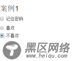
<form role="form"> <h3>案例1</h3> <div> <label> <input type="checkbox" value=""> 记住密码 </label> </div> <div> <label> <input type="radio" value="love" checked> 喜欢 </label> </div> <div> <label> <input type="radio" value="hate"> 不喜欢 </label> </div> </form>
效果图:
8.复选框和单选按钮水平排列
有时候,为了布局的需要,将复选框和单选按钮需要水平排列。Bootstrap框架也做了这方面的考虑:
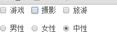
1、如果checkbox需要水平排列,只需要在label标签上添加类名“checkbox-inline”
2、如果radio需要水平排列,只需要在label标签上添加类名“radio-inline”
<form role="form"> <div> <label> <input type="checkbox" value="option1">游戏 </label> <label> <input type="checkbox" value="option2">摄影 </label> <label> <input type="checkbox" value="option3">旅游 </label> </div> <div> <label> <input type="radio" value="option1">男性 </label> <label> <input type="radio" value="option2">女性 </label> <label> <input type="radio" value="option3">中性 </label> </div> </form>
效果图:
9.按钮
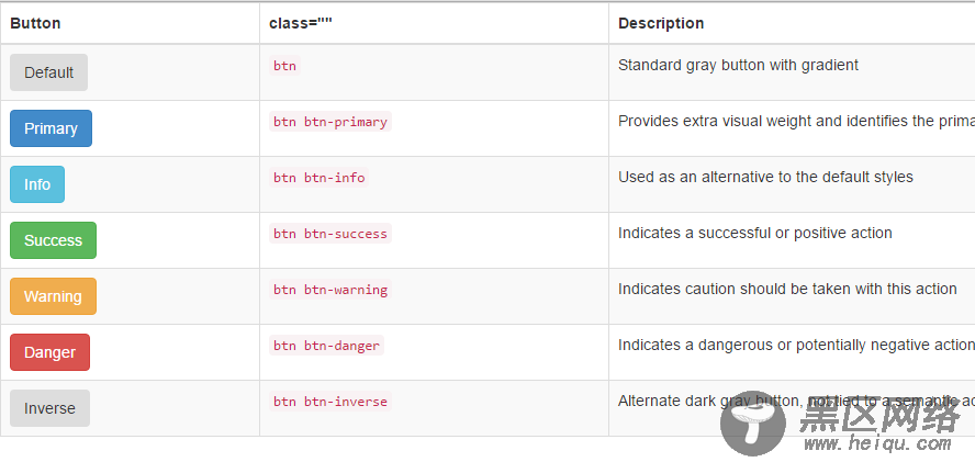
在Bootstrap框架中的按钮都是采用来实现
<table> <thead> <tr> <th>Button</th> <th>class=""</th> <th>Description</th> </tr> </thead> <tbody> <tr> <td><button href="#">Default</button></td> <td><code>btn</code></td> <td>Standard gray button with gradient</td> </tr> <tr> <td><button href="#">Primary</button></td> <td><code>btn btn-primary</code></td> <td>Provides extra visual weight and identifies the primary action in a set of buttons</td> </tr> <tr> <td><button href="#">Info</button></td> <td><code>btn btn-info</code></td> <td>Used as an alternative to the default styles</td> </tr> <tr> <td><button href="#">Success</button></td> <td><code>btn btn-success</code></td> <td>Indicates a successful or positive action</td> </tr> <tr> <td><button href="#">Warning</button></td> <td><code>btn btn-warning</code></td> <td>Indicates caution should be taken with this action</td> </tr> <tr> <td><button href="#">Danger</button></td> <td><code>btn btn-danger</code></td> <td>Indicates a dangerous or potentially negative action</td> </tr> <tr> <td><button href="#">Inverse</button></td> <td><code>btn btn-inverse</code></td> <td>Alternate dark gray button, not tied to a semantic action or use</td> </tr> </tbody> </table>
效果图:
10.表单控件大小
前面看到的表单控件都正常的大小。可以通过设置控件的height,line-height,padding和font-size等属性来实现控件的高度设置。不过Bootstrap框架还提供了两个不同的类名,用来控制表单控件的高度。这两个类名是:
1、input-sm:让控件比正常大小更小
2、input-lg:让控件比正常大小更大
这两个类适用于表单中的input,textarea和select控件.